Community
cancel
Showing results for 
Show  only  | Search instead for 
Did you mean: 

[UI UV Editor] A more clean, tidy and fresh UI like the new Maya one

[UI UV Editor] A more clean, tidy and fresh UI like the new Maya one

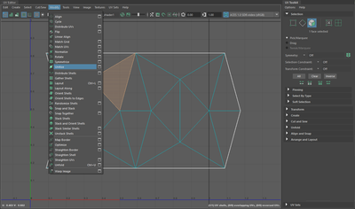
The new UV editor and UV toolkit in Maya was inspired by a cool third-party plugin and this is obvious. It just looks so fresh. Packed with features, carefully organized, proper spacing etc. Max one only got new icons with the new releases but nothing more. Pls. update its style and reorganize its layout already!


Maya UV tookit.jpg


3ds Max Uv editor.png

9 Comments
tom.butters
Contributor

I agree, definitely does need a bit of a revamp, layout wise. Im guessing the tip image is Maya? It's really nice in comparison to Max's version. Perhaps a toggle for icon names +icons like that of Maya ? 

Yeah, that also. And you triggered me another idea in my head. and that for the Edit Poly modifier. Combining nice clear color coded  iconography with Text. If we look into the Max menus we can see some decent job has been done with the iconography but its a shame this is  hidden into the menus.


First of all I dont know if the UV editor and Unwrap UVW UI has made the switch to QT.  Also  what I forgot to display here are the marking , context menus inside the Maya UV editor which are so versatile and robust and ofc have a nice iconography that they are alone enough to do your job inside there  and you dont actually need all this carefully organized UI lol. Its ridiculous Maya didnt need this great revamp  but it got it.

Anonymous
Not applicable

UVW window should be in extended viewports and the icons and the roll ups transferred to the modifier, also i agree a clean up with icons will help. 

tom.butters
Contributor

I think whilst we're on the topic of improving the UV Editor, I echo what @Anonymous has said; I really do think the UV Editor should have the option to be dockable in the viewport, that or at least improve the performance of having the editor on a separate monitor, I would love for that to happen. 

yeah, good point that goes without saying. Also I like his the idea of Unifying the Command Panel Modifier Buttons with those on the UV editor window and ofc more carefully organized altogether. Pretty much like the Maya UV toolkit does. There is too much redundancy there.

PaulCPC
Contributor

They are looking into AI driven UVs and automation in UV seams.

dswahn
Advocate

If the interface for the UVW Editor should be redesigned I'd say that having buttons on larger horizontal bars is not really a good idea because smaller windows makes certain toolbars cover other toolbars. Yeah, you can scroll them horizontally, but I'd prefer to have everything in one single horizontal toolbar in that case. It would make it more predictable, just like scrolling the vertical toolsets will scroll all the tools in the set, not just a subset of them.


3dsmax_2022-04-01_20-45-43.gif 

 
stealthvic
Participant

I'm guessing Autodesk has no plans to improve this, it's been ages people have been requesting this. I've been using Max for 21 years, out of all my colleagues I'm the last the use it. Others have moved on to Blender or Maya. Incredibly disappointing.

Can't find what you're looking for? Ask the community or share your knowledge.

Submit Idea  

Technology Administrators


Autodesk Design & Make Report