@Kent1Cooper wrote:
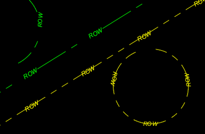
Just to be sure I understand, does that description mean this?

including having the longer dash running through the Text?
....
On the assumption [if you're still watching] that the answer to that question is Yes:

[The definition in Message 2 makes the green parts.] The yellow parts were made with this definition:
A,.125,-.125,.3125,["ROW",STANDARD,S=.08,X=-.13,Y=-.04],.3125,-.125,.125,-.125
["STANDARD" text Style is defined for Arial Italic without fixed height. Use your appropriate Style name.]
No R entry -- if it's zero, you can just omit it. Consider using the U option instead, for more upright text regardless of drawn direction.
The longer dash is actually in two touching pieces, with the text "between" them. The negative X value [fine-tune the number for the length of the text] "backs off" the starting point of the text inclusion by half the text length in the back-off from the direction the path is headed at that point, which makes for better alignment along curves [compare those in the yellow Arc to the one in the green Arc].
Kent Cooper, AIA 


