Announcements
Visit Fusion 360 Feedback Hub, the great way to connect to our Product, UX, and Research teams. See you there!
cancel
Showing results for 
Show  only  | Search instead for 
Did you mean: 

Making the nice new UI even better

Making the nice new UI even better

Although the Fusion 360 new UI looks really great and I appreciate all the work being done in creating the concept and designing and developing it, but I find it a little confusing. The reason is that the tabs are not sufficiently distinguishable in my opinion. Please take a look at the pictures below:


New_UI_1.png

New_UI_2.png


For making tabs more distinguishable I suggest using the following design or something similar:
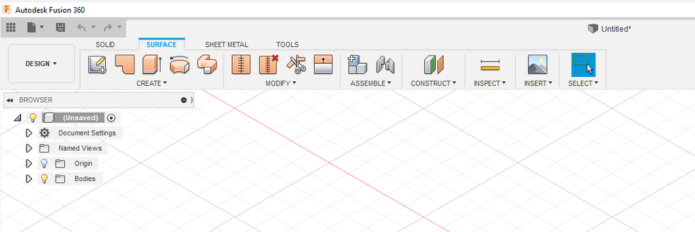
 

New_UI_3.pngNew_UI_4.png


PS: At the time of this writing, the new UI is in preview mode and can be activated using Preferences > Preview > UI Preview check box

6 Comments
Leo_Dyn
Advocate

Those few lines you added in make such a great difference!


Without those, on first glance it looks like the "solid" "surface" "sheet metal", etc. are headings for the tools you can see and not tabs to different tools all together. I know what they are going for and it still throws me with the lack of separation.

derekmcleod
Contributor

I think that small bit of differentiation is very important. If not as you have shown, then an indication when you hover over that those are in fact 'buttons' and not just static text. When I switched to the new UI, I thought that the Patch workspace had disappeared since I didn't realize it was contained within Surface, which I also didn't realize is actually a tab. 

danh818
Contributor

Nice little addition.. makes a big difference.

danh818
Contributor

Can we also get the outlined area back?InkedNew_UI_4_LI.jpg  The new UI actually has less total usable screen real estate.  If we had smaller buttons and a toolbar that expanded and contracted as needed we would get back a good bit of usable space.  It annoys me that the outlined area isn't transparent in the new UI as it was in the old.    

nnikbin
Collaborator

Hi @danh818,

Thank you for your comments. I totally agree with you that it is more better to have a toolbar with transparency in the area you outlined or perhaps in a smaller area at the right side of the toolbar (which is not occupied by design tabs). I suggest you post your idea to Fusion 360 Preview Functionality forum and Fusion 360 IdeaStation.

yeah, a bit of separation wouldnt hurt

Can't find what you're looking for? Ask the community or share your knowledge.

Submit Idea  

Autodesk Design & Make Report