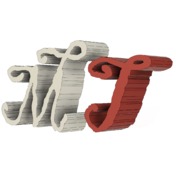
Well, Mr. Jean-Michel.Legoff,
So we are back to the square one.
Consider reversing your workflow. Build your primary logo resource natively in F360 and derive from it other forms, let say a logo. In this way, you will avoid such pitfall like this. It is always better for most stable personalities to have a virgin and trusted part rather than a convert, segmented, or have you by other soft characters with suspicious influences.
SVG knocks around many places, have vibrous relations with MS mice very often and frequently causes many problems, as many on this forum noticed.
Regarding your latest post showing examples of rough edges of their curvatures… bear in mind they might not be smooth by their native design in the first place. Many font graphics originated in the raster world and later were adapted to vector space. As such they can’t be used as the reference. They carry the previous era inflicted imperfections.
Today there are probably billions of glyphs designed. Only small portions of them can be considered by looking at their curvatures to participate in Glyph Universe contest.
Of course, one can think about improving these billions of font inhabitants. Here are some obvious options:
- Find the proper leadership (Gothic, Cyrillic, 黑体,..), select mischieving glyphs, concentrate them in rehab depositories and smooth them up
- Employ Sheriff and straight them one by one.
- Establish Glyph Facelift company and do business removing their grincles, becoming billionaire in the process.
- Or you might have a better idea?
Regards
MichaelT
MichaelT