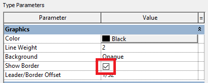
Recently I helped out a project team with a Generic Annotation. It needed to be a simple text label in a box. To ensure that the box flexed with the amount of text entered, the Label style was created with Show Border checked.
But (as always) I digress - this was not the reason for the misbehavior (and this post) that was vexing the Project team -
And also
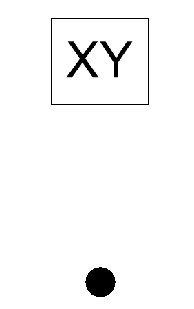
Where did that big gap come from? Why is it there?? Will we need to draw a line over it??? Mass panic and so many questions, questions, questions.....
One thing that needs to be remembered about leaders is that their origin is affected by the size of the text box used in the label and any other linework or geometry that there may be. Here is a Before picture of the label as seen in the Family - you can see a lot of white space on each side of the sample text that appears to have affected the position of the leader
with these Properties -
And here is an After picture
I resized the Label text box to be tight to the sample text - it will flex along with the text - and changed the justification.
(I know - TOP???? The results from a process of trial and error surprised me too!)
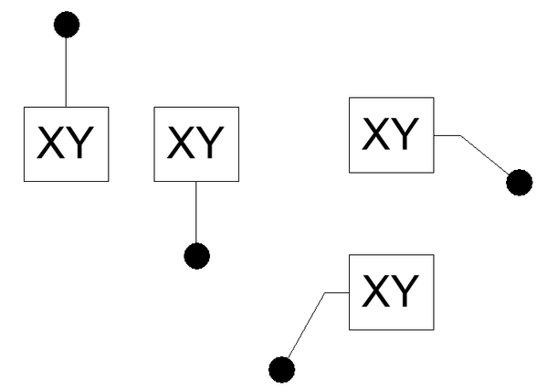
The final result - no more unsightly gap!
The leader origin will center itself on the extents of the geometry in the family, and can be cheated by adding an invisible component. This gives rise to possibilities to position leaders exactly where you want them. Talk about control....
PS - another (neglected) segue is the arrowhead that you seen in the screenshot - select the placed symbol and click Edit Type to select the desired arrowhead.
You must be a registered user to add a comment. If you've already registered, sign in. Otherwise, register and sign in.


