Community
- Forums Home
- >
- 3ds Max Community
- >
- 3ds Max Forum
- >
- Re: How can I change UI of 3DS max 2017 to look like 2014?
3ds Max Forum
Welcome to Autodesk’s 3ds Max Forums. Share your knowledge, ask questions, and explore popular 3ds Max topics.
Turn on suggestions
Auto-suggest helps you quickly narrow down your search results by suggesting possible matches as you type.
How can I change UI of 3DS max 2017 to look like 2014?
213 REPLIES 213
SOLVED
Reply
Topic Options
- Subscribe to RSS Feed
- Mark Topic as New
- Mark Topic as Read
- Float this Topic for Current User
- Bookmark
- Subscribe
- Printer Friendly Page
Message 1 of 214
04-21-2016
09:45 AM
- Mark as New
- Bookmark
- Subscribe
- Mute
- Subscribe to RSS Feed
- Permalink
- Report
04-21-2016
09:45 AM
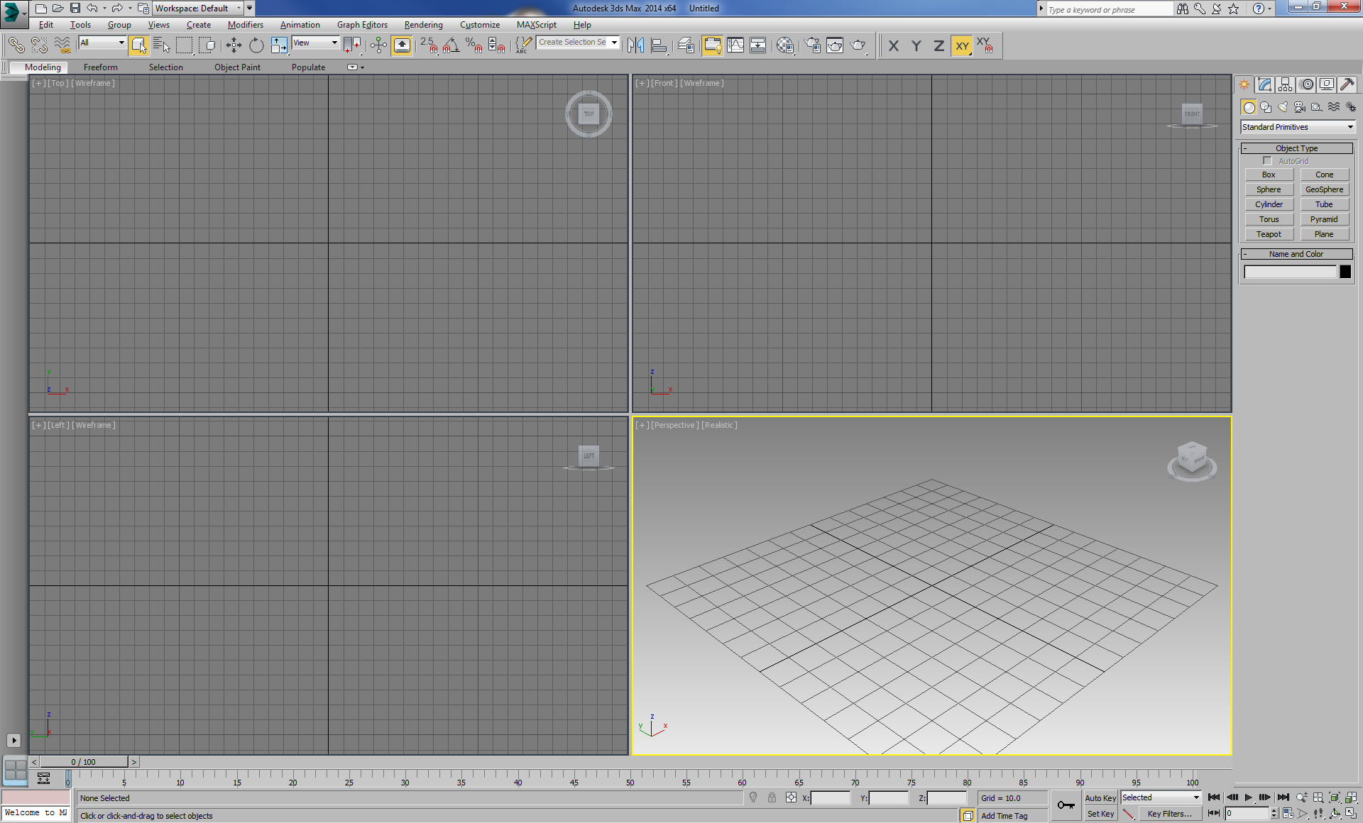
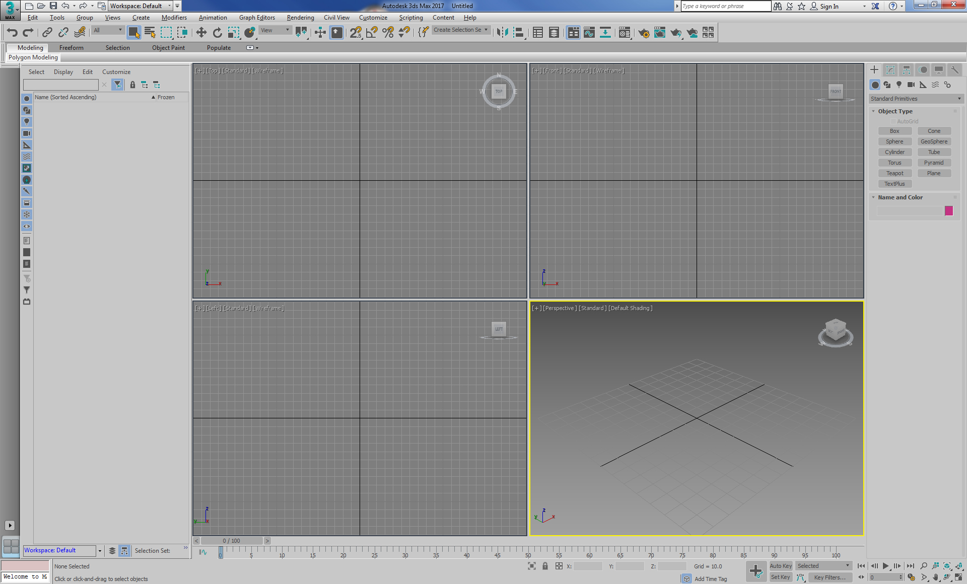
I've tried unsucessfully to change the UI scheme of 2017 to resemble something I'm used to working in. Posted are screen shots from 2014 & 2017. Is this as close as I can hope to get? Exporting & importing UI theme did not seem to work. Thank you for any insight.
Solved! Go to Solution.
Solved by zaluski. Go to Solution.
Solved by zaluski. Go to Solution.
213 REPLIES 213
Message 21 of 214
08-08-2016
07:48 PM
- Mark as New
- Bookmark
- Subscribe
- Mute
- Subscribe to RSS Feed
- Permalink
- Report
08-08-2016
07:48 PM
You can go somewhat closer than that, and in some ways the colors customization is even better in 3ds max 2017, and in other ways it's worse. For example you can't customize the color when you press the sub-objects on a modifier. So you can't make it orange/yellow like it was for the last 10 years I think.
BUt you can increase the contrast a little so it doesn't appear so washed out.
And I think some color options in "Customize User Interface" do nothing. Don't work.
Next I will look into a way to change the icons, because some icons are blurry and unclear. Without even going to the whole "get with the times, new icons are in, you can't expect Autodesk to stand still and not innovate their icons"

And if the flat and low contrast / low visible UI are so in and hip, why not go all the way ? With something like this 🙂
People with less than perfect vision should stay out. And for the rest, this UI will provide a good eye "workout" while doing 3d graphics.

Message 22 of 214
08-09-2016
10:56 AM
- Mark as New
- Bookmark
- Subscribe
- Mute
- Subscribe to RSS Feed
- Permalink
- Report
08-09-2016
10:56 AM
<<Without even going to the whole "get with the times, new icons are in, you can't expect Autodesk to stand still and not innovate their icons">>
Hopefully this is sarcasm. Changing the icons has zero innovative value, and it hardly makes sense from a branding perspective. Like they are trying to turn off their ENTIRE user base. Imagine being at the conference table when that decision was being made. "Duh...ok...let's do that!"
Hopefully this is sarcasm. Changing the icons has zero innovative value, and it hardly makes sense from a branding perspective. Like they are trying to turn off their ENTIRE user base. Imagine being at the conference table when that decision was being made. "Duh...ok...let's do that!"
Message 23 of 214
08-11-2016
01:00 PM
- Mark as New
- Bookmark
- Subscribe
- Mute
- Subscribe to RSS Feed
- Permalink
- Report
08-11-2016
01:00 PM
Yeah. Thank god for the option to customize the 3ds max interface.
And about the icons, the new ones are not sharp enough, and some are not descriptive enough.
Message 24 of 214
10-14-2016
11:17 AM
- Mark as New
- Bookmark
- Subscribe
- Mute
- Subscribe to RSS Feed
- Permalink
- Report
10-14-2016
11:17 AM
Try to leave the attitude on Facebook. There are people who are trying to actually work with the software.
Message 25 of 214
10-14-2016
11:21 AM
- Mark as New
- Bookmark
- Subscribe
- Mute
- Subscribe to RSS Feed
- Permalink
- Report
10-14-2016
11:21 AM
However, the problem here is that Autodesk DOES seem to jump at every UI trend, and it NEVER works. They've done this in 2004, and again in 2010. It was so awful in 2010 that that they literally went back to the icons for 2009 in the next iterations. They aren't learning this important lesson: Pandering to millenials and high school kids by making the UI look like an iPhone app doesn't work when you're subscription base are hard-working professionals who need the icons to be stable and recognizable, not trendy.
Message 26 of 214
11-15-2016
08:15 AM
- Mark as New
- Bookmark
- Subscribe
- Mute
- Subscribe to RSS Feed
- Permalink
- Report
11-15-2016
08:15 AM
So here's the great thing. I really, really, hate the new UI, and I was holding off moving to 2017 because of that alone. But, times must move forward. So I started to change the UI.
What boggles my mind is that a lot of the icons exist, and were provided as part of the install package; quite possibly as a hold over from previous versions. Nevertheless, someone had the infinite wisdom to change the file names (completely unnecessarily, best I can tell) to make the process of changing the icons as difficult as humanly possible. Names that may or may not exist in the previous collection, a folder structure that doesn't make complete sense (snap icons in two different folders, etc.) It's astonishing. And, even better, the "CustomControlsOptions.PrintIconPaths=true" script doesn't actually tell you what all the icons are throughout the interface.
I spent a couple hours fishing and hunting icons, so at least some of the more common icons are now the same as 2016. Though I'm reasonably sure they'll change the whole paradigm next time.
My position is this: it's a tool. One doesn't change the buttons on a tool for fashion. Especially when fashion decreases the utility or transposition of the previous skillset. How would you feel if one day, you bought a new phone, and you had to figure out how to use it all over again? What if your tool had ONE THOUSAND BUTTONS? Evolve them, fine, such that they work as well as they did, without thought. Don't get fashionable, because you make *ALL* of your users waste time and effort adapting to a pointless change. Yeah, I'll learn it eventually, but how many seconds (becoming minutes, hours) have I wasted, not doing something that earns me money, or helps me get to a deadline? If I have to completely re-learn the UI, I might as well completely relearn different software.
And if you want to be fashionable, no problem. Just take the time concurrently to make it easy to revert. Set up a consistent naming convention. Have a utility that will swap out icons (why can't I do this in "customize user interface"?) or whatever. Or just stop being fashionable. I don't care if my chainsaw has a 32bit color screen on it - I can't look at it while I'm cutting wood!
I've attached the icon set that I created to get to the changes I did. I use AME light, so you dark folks are SOL. You put this in
<Install Location>\Autodesk\3ds Max 2017\UI_ln\Icons
Mileage may vary. I may add updates as I make them, if anyone cares.
Kris.
Message 27 of 214
11-15-2016
10:50 AM
- Mark as New
- Bookmark
- Subscribe
- Mute
- Subscribe to RSS Feed
- Permalink
- Report
11-15-2016
10:50 AM
Hi Kris, I honor your issues. Pretty sure I was an early poster raising these points. I was working on a project with deadline, and the source file was in max 2017, so I naturally started working in that version, but under time pressure. It make me angry also. I ended up downsaving the file and finished the work in 2015.
I did want to explore some of the new features, so once I had time, I returned to 2017. I considered doing what you did, but I'm way lazier than you. I decided to use my instinct as to what buttons to push, and for the most part it worked. I found out I didn't really need the icons! I knew where the modify stack button was, etc.
So, over the past few weeks, I've been working on a vanity project, no deadline, in 2017. I'm finding aspects of the ui that I prefer over prev versions. I think I'm pretty close to as productive now on 201`7 as before.
Best,
Bob
Message 28 of 214
11-15-2016
12:33 PM
- Mark as New
- Bookmark
- Subscribe
- Mute
- Subscribe to RSS Feed
- Permalink
- Report
11-15-2016
12:33 PM
Well, I guess that's good, but while I generally know where stuff is, I still rely on the color/contrast in my peripheral vision to know that I've got the cursor in the right place. Without those indicators, my brain (as I said, mileage my vary) says, "oh, are you sure that's the right place?" and I look to check. That is an irritant, and a time waster.
So, if anything, I posted for the benefit of anyone else who might come across the thread... and the ludicrous dream that AD might get wind of the consequences of their ongoing stupid. But, then, if not in the first 25 years...
All the more reason why I rely more and more on keyboard shortcuts. Though I'm sure they'll change all those in 2018, just to inconvenience us that much more. 🙂
Kris.
Message 29 of 214
11-15-2016
05:57 PM
- Mark as New
- Bookmark
- Subscribe
- Mute
- Subscribe to RSS Feed
- Permalink
- Report
11-15-2016
05:57 PM
I'd like to post as a user here, putting aside my Autodesk hat for a second.
I still am not used to some of the icons in 2017. I sit sort of on both sides of the fence on this. What I would really like to see is the ability to load ui themes which include new icons, fonts, colors, etc. Browsers used to have skin packs like this. I like this because then the community or users themselves can have control over the themes and the popular ones would stand out eventually. From that a lot of knowledge could be gained about UI and usability and how users prefer things. I'd love to be able to go to a sub forum, check out the "Tron", "Hulk" or "Serenity" theme for Max with all the buttons/icons and colors already setup and find the right one for me. The functionality of course is 99% already there in 3ds Max but the time investment and lack of an organized delivery system does put a damper on it, plus I can never seem to find the time to make a bunch of new icons.
I don't mind the cyan and orange color scheme really, but I prefer brighter RGB ones and I do really want color in my command panel icons. (Not unlike Max 9 but minus the reactor toolbar.) Anyhow... back to work.
Best Regards,
![]()
Alfred (AJ) DeFlaminis
3ds Max Technical Support Specialist
Autodesk Here to Help | View Max Tips/Tricks | My Screencasts | Autodesk Virtual Agent | How To Reset User Settings | Change Display Drivers in Max | Feature Request Board | Installation and Licensing Forum | 3ds Max Certified Hardware | Network Rendering Troubleshooting Guide
Message 30 of 214
11-16-2016
07:40 AM
- Mark as New
- Bookmark
- Subscribe
- Mute
- Subscribe to RSS Feed
- Permalink
- Report
11-16-2016
07:40 AM
What makes the UI change especially problematic is that, as an educator, all of the video tutorials I have recorded for the old MAX UI are much harder to follow in the MAX 2017. Hundreds of hours of instructional videos are now less effective because their new icons are so dissimilar to the originals AND there is no easy way to revert to the old ones. This needs to be fixed in a service pack. Allow the old icons to be used.
Message 31 of 214
11-16-2016
08:04 AM
- Mark as New
- Bookmark
- Subscribe
- Mute
- Subscribe to RSS Feed
- Permalink
- Report
11-16-2016
08:04 AM
I've been in the vocal group that really dislikes the new color scheme.
The current colors blend too many functions into too similar colors and it's hard to distinguish one thing from the next (for me).
Although I'm not a fan of these colors, I am happy with the UI team's work to make the UI faster and snappier. So they need to hear that they get some kudos too,
Relating to the newer UI theme: even though I do not like it, I do recognize that younger people are more apt to like it. I work with many younger artists and they are generally pleased with the theme updates (based on casual discussions). And the more I've used 2017 the more normal it is starting to feel.
But that doesn't mean I'm going to stop clamoring for more distinguishable colors to come back and less abstract icons. For example, compare the legacy snap icons between 2017 and older and you'll see immediately that the older icons are directly related to the function and mostly unambiguous; the new snap icons have plenty of ambiguity and even contradict the icon meanings of the last many years (legacy snap to edge is now snap to face!!!). Snap to Vertex icon now has as many edges as vertices (creating ambiguity), snap to edge now has a filled polygon and an empty polygon (which is confusing)... Etc. I've already railed on about this here and in the beta forums. I'm no longer hostile about the changes... but I'm not personally happy with these kinds of changes.
I think that most professionals are mainly irritated with the changes that make them have to waste time on tracking down the right button/menu. Overall, the UI is still the Max we all know and love... but many (not saying all) of the icons and colors are a monkey wrench that slows down the gears in our minds.
Shawn Olson
Developer of Wall Worm
3ds Max plugins and Scripts
3ds Max 4/Gmax - 3ds Max 2020
Mudbox 2009-2019
Windows 10 x64
i7 8700K
64GB RAM
Geforce 1080ti
Message 32 of 214
11-16-2016
08:53 AM
- Mark as New
- Bookmark
- Subscribe
- Mute
- Subscribe to RSS Feed
- Permalink
- Report
11-16-2016
08:53 AM
@reapinwombat wrote:
What makes the UI change especially problematic is that, as an educator, all of the video tutorials I have recorded for the old MAX UI are much harder to follow in the MAX 2017. Hundreds of hours of instructional videos are now less effective because their new icons are so dissimilar to the originals AND there is no easy way to revert to the old ones. This needs to be fixed in a service pack. Allow the old icons to be used.
That's actually a pretty good lesson to the students - when dealing with software the only constant is change. They'll have little say in what program, or even what version, they'll be using for any given employer or project. They'll have to deal with that whether they go to a new employer, or their current one decides to switch programs, or updates to a newer version. They need to be able to adapt to situations they aren't used to. People who refuse to or cannot accept that can (and will) be replaced.
----------------------------------
If you are going to fly by the seat of your pants, expect friction burns.
"I don't know" is the beginning of knowledge, not the end.

If you are going to fly by the seat of your pants, expect friction burns.
"I don't know" is the beginning of knowledge, not the end.
Message 33 of 214
11-16-2016
08:55 AM
- Mark as New
- Bookmark
- Subscribe
- Mute
- Subscribe to RSS Feed
- Permalink
- Report
11-16-2016
08:55 AM
Thank you kris for your hard work. I imagine it took quite a while.
It's not about being against change, but as others said here, the older icons are more "clear".
Message 34 of 214
11-16-2016
10:02 AM
- Mark as New
- Bookmark
- Subscribe
- Mute
- Subscribe to RSS Feed
- Permalink
- Report
11-16-2016
10:02 AM
Ow, hadn't thought of that hassle...sorry for your troubles. I suppose
in the bigger picture, though, changes to the tools must always
represent problems for your profession. This time its a real pain, but
doesn't the onset of new tools also damage the residual value of your work?
in the bigger picture, though, changes to the tools must always
represent problems for your profession. This time its a real pain, but
doesn't the onset of new tools also damage the residual value of your work?
Message 35 of 214
11-16-2016
10:02 AM
- Mark as New
- Bookmark
- Subscribe
- Mute
- Subscribe to RSS Feed
- Permalink
- Report
11-16-2016
10:02 AM
Ow, hadn't thought of that hassle...sorry for your troubles. I suppose
in the bigger picture, though, changes to the tools must always
represent problems for your profession. This time its a real pain, but
doesn't the onset of new tools also damage the residual value of your work?
in the bigger picture, though, changes to the tools must always
represent problems for your profession. This time its a real pain, but
doesn't the onset of new tools also damage the residual value of your work?
Message 36 of 214
11-16-2016
03:35 PM
- Mark as New
- Bookmark
- Subscribe
- Mute
- Subscribe to RSS Feed
- Permalink
- Report
11-16-2016
03:35 PM
Hello @reapinwombat,
I can relate. As a 10 year college instructor of 3ds Max and Maya I've seen this happen a number of times. I had a book once that was very hard to use because it referenced Reactor a lot and that's been gone for a while. This was during a time when MassFX didn't have comparable tools for certain things and no text book with MassFX in it yet. The one thing I've come to fully understand about the field in general moving forward is simply, 'Expect the unexpected.' (This advice has annoyed many Hitch-Hikers in that it is ‘A’ - glib, and ‘B’ - a contradiction in terms.) If you told me 10 years ago that rendering would be pushed out to graphics cards and start to be abandoned on CPU's I would have scoffed.
I don't know that there is an easy answer but I do know that you have a completely valid concern, but one that will always be an issue moving forward. If you want to make your own icons, there is an article here on the changing process.
For 2016 icons, Dominique and Jon at Autodesk put together an 2016 icons to 2017 pack, which I have attached to this message. Instructions below. This should handle the bulk of the icon changes, but in 2017 the command panel icons are basically locked right now.
|
To use this icon workaround:
|
Best Regards,
![]()
Alfred (AJ) DeFlaminis
3ds Max Technical Support Specialist
Autodesk Here to Help | View Max Tips/Tricks | My Screencasts | Autodesk Virtual Agent | How To Reset User Settings | Change Display Drivers in Max | Feature Request Board | Installation and Licensing Forum | 3ds Max Certified Hardware | Network Rendering Troubleshooting Guide
Message 37 of 214
11-16-2016
04:52 PM
- Mark as New
- Bookmark
- Subscribe
- Mute
- Subscribe to RSS Feed
- Permalink
- Report
11-16-2016
04:52 PM
Alfred,
Thank you for the thoughtful reply and the archive. I'll see if I can incorporate this for my students somehow.
-Greg
Message 38 of 214
11-16-2016
05:04 PM
- Mark as New
- Bookmark
- Subscribe
- Mute
- Subscribe to RSS Feed
- Permalink
- Report
11-16-2016
05:04 PM
Bob,
You make a good point. It is hard for a software tutorial to remain immortal. What is challenging in this case is that students see me click on one icon, and they cannot find its match in the max 2017 interface. If there were just a few changed icons, they have context and can use process of elimination to narrow it down. When all the icons look very dissimilar, it forms a barrier to learning. If they had used MAX before, they have a starting point. For young students without a reference point its almost impossibly hard. If I thought the new icons were superior (clearer, more intuitive, etc), I would consider recording all my material because I would embrace and value the improvement. That's not the case here.
Someone else mentioned learning new software is a skill and if you can't hack it then tough (my paraphrasing). That is not the way educators view our students. Period.
-Greg
Message 39 of 214
11-17-2016
06:19 AM
- Mark as New
- Bookmark
- Subscribe
- Mute
- Subscribe to RSS Feed
- Permalink
- Report
11-17-2016
06:19 AM
Change is inevitable. I have no issue with change, generally speaking. But there are limits; when it comes to the tools that I use every day to make a living, I expect that change to be gradual, sensible, and to improve my functionality. There's no reason why the UI shouldn't be improved; in fact, I think there are a lot of aspects within max that could stand a good beating. But at the end of it, a long time user and a new user should both be able to recognize the UI, and clearly be able to distinguish elements.
I've been a max user since 2.5; there has obviously been evolution in that time. The first time I opened 2017, my first thought was "where in the hell is everything?" Even buttons that I use all time, like maximize viewport, I had to look at for a few seconds and guess that they were the right ones. Having used 2017 for a week, there are aspects of the UI (like the creation tabs) where I have to concentrate every time to know where I'm clicking, and, apparently, one cannot change those icons. I'm sure this will improve with time, but I am sincerely worried that they'll change it all up again.
As I said in my previous post, make it fashionable. Just give the option for change back. As with all aspects of software, if it's done carefully, with forethought, and careful naming conventions, then switching it up should be trivial. All aspects that are presented to the user should be easy to change, in specific or bulk. If I got into my car, and the gas pedal and brake pedal were further apart, the steering wheel was a square and 3x as sensitive, and my signal lever was a button with ~~ on it, I would no longer be a proficient driver; having to spend time concentrating on the controls, and not the task at hand.
It comes down to a cultural decision within AD: usercentric, or profitcentric. AD proclaims the former, but their actions say the latter, since their decisions are towards fashion, and they do not want to spend the resources to have the ability to do it both ways. (This isn't limited to the UI.) Just like Microsoft and their move to "tablet friendly" which makes the desktop experience a nightmare. The new versions of Skype are a pain to use because of their efforts to be more "bubbly", with no way to revert. It goes on. Giving the user the ability to revert to what is familiar in no way detracts from the 'new user' experience. It simply avoids alienating the 'bread and butter'.
Kris.
Message 40 of 214
11-17-2016
06:22 AM
- Mark as New
- Bookmark
- Subscribe
- Mute
- Subscribe to RSS Feed
- Permalink
- Report
11-17-2016
06:22 AM
Thanks, Alfred. That file fixes a lot of the things I couldn't find...
Kris.
Reply
Topic Options
- Subscribe to RSS Feed
- Mark Topic as New
- Mark Topic as Read
- Float this Topic for Current User
- Bookmark
- Subscribe
- Printer Friendly Page