Community
Revit MEP Wishes (Read Only)
Turn on suggestions
Auto-suggest helps you quickly narrow down your search results by suggesting possible matches as you type.
Reply
Topic Options
- Subscribe to RSS Feed
- Mark Topic as New
- Mark Topic as Read
- Float this Topic for Current User
- Bookmark
- Subscribe
- Printer Friendly Page
Message 1 of 8
Anonymous
1436 Views, 7 Replies
07-30-2008
02:51 PM
- Mark as New
- Bookmark
- Subscribe
- Mute
- Subscribe to RSS Feed
- Permalink
- Report
07-30-2008
02:51 PM
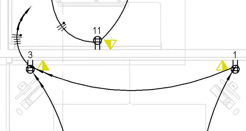
homerun arrows
i would like to see the flexibility of turning off homerun arrows in a circuit run that when creating a circuit of a number of devices they dont show up until you get to the homerun itself. or give us the flexiblity to size and move the homeruns along a circuit so that they dont look a bit "special" when it bumps a device
7 REPLIES 7
Message 2 of 8
Anonymous
in reply to:
Anonymous
07-30-2009
04:05 PM
- Mark as New
- Bookmark
- Subscribe
- Mute
- Subscribe to RSS Feed
- Permalink
- Report
07-30-2009
04:05 PM
Absolutely necessary, the arrowheads showing up on downstream device circuits obliterate the device they are connected to.
Message 4 of 8
Anonymous
in reply to:
Anonymous
07-11-2012
11:15 AM
- Mark as New
- Bookmark
- Subscribe
- Mute
- Subscribe to RSS Feed
- Permalink
- Report
07-11-2012
11:15 AM
It is very odd that by this time with so many engineers having the same concern that a fix has not been created. There is no designer anywhere that would consider this graphic flaw in circuiting acceptable. Please Autodesk if you have any concern on the correct graphic output of the Revit Electrical system fix this as soon as possible.
Message 5 of 8
Anonymous
in reply to:
Anonymous
04-22-2013
02:26 PM
- Mark as New
- Bookmark
- Subscribe
- Mute
- Subscribe to RSS Feed
- Permalink
- Report
04-22-2013
02:26 PM
I may be new to Revit MEP but the inital post was on: 07-30-2008 02:51 PM. The last post on this discussion group was on 07-11-2012 11:15 AM.
Out of sheer curiosity, does Autodesk - who as an unbelievable source of manpower - cannot (for the life of me) resolve this or be willing to even listen to this minimal request after 4+ years?
Is it maybe because only four interested, 5 now including me, have made comments? Makes me wonder how much more till a wish is finally granted...
By the way, been trying to figure this out and still to no avail on MEP 2013 - the arrows just doesn't look graphically right, yet it seems that Autodesk thinks its fine when it comes to circuiting! Quite ironic in a sense.
Here's to hoping ![]()
Message 6 of 8
Anonymous
in reply to:
Anonymous
04-22-2013
02:38 PM
- Mark as New
- Bookmark
- Subscribe
- Mute
- Subscribe to RSS Feed
- Permalink
- Report
04-22-2013
02:38 PM
even if we can turn it off on vv/vg settings it still doesn't work the way one would like it shown. more control would be better for sure.
Message 7 of 8
04-26-2013
04:03 PM
- Mark as New
- Bookmark
- Subscribe
- Mute
- Subscribe to RSS Feed
- Permalink
- Report
04-26-2013
04:03 PM
This absolutly needs to be fixed. Working in the design build field with contractors, it gets brought up over and over again about how the homeruns look <insert word here>! Also, the multiple arrows at the end of the run in not necessary either, please make this a non-defaut option rather than the only option.
Message 8 of 8
06-18-2013
01:01 PM
- Mark as New
- Bookmark
- Subscribe
- Mute
- Subscribe to RSS Feed
- Permalink
- Report
06-18-2013
01:01 PM
It is very very sad that after 5 years, not we're still asking for HOME RUN ARROWS. Come on Autodesk, listen to the cries of the electrical industry. We're feeling negelected here!!!
Shawn B.


 |
| 

To help improve Autodesk Products, please Click Here to Vote for ideas and submit your own.
To help improve Autodesk Products, please Click Here to Vote for ideas and submit your own.
Reply
Topic Options
- Subscribe to RSS Feed
- Mark Topic as New
- Mark Topic as Read
- Float this Topic for Current User
- Bookmark
- Subscribe
- Printer Friendly Page
Forums Links
Can't find what you're looking for? Ask the community or share your knowledge.
Post to forums
